Server-side analysis (heat map)
Now that we have our overlay grid working, let’s implement some analysis on the server and visualize it using the grid. The analysis we will implement is a basic point density heat map. This type of heat map represents the relative density of points across space. When used with an analysis grid, it works by having each data point contribute to the ‘heat’ value of the grid points around it, relative to its distance to those points. The point density heat map does not look at any data associated with those points, but only the density of those points in space. Thus it can be used to explore patterns in the overall density in a set of geographic data, but does not reveal any patterns in the values of this data. It can also be easily implemented with math operations using a set of data points and our existing grid, and does not require any complex Machine Learning analysis, which we will come to in the next set of tutorials.
Creating helper functions
The heat map analysis will be implemented on the server side of our Web Stack, at the same time that the geometry of the grid is generated. Switch to the 03-server-side-analysis branch in the ‘week-5’ repository. Now open the app.py file from the main repository directory in a text editor. To implement the heat map, we will need some math operations that are not included in the basic distribution of Python. So the first thing we will do is write a few helper functions that will perform these operations. We will implement these functions at the very top of the app.py file, right after the import statements and before any other functions. This will ensure that the functions are loaded and available before any other code is run.
The first function will calculate the distance between two points, which we will need to calculate how much ‘heat’ a sample point applies to the grid cells around it. Find the line that says:
q = Queue()
After this line, write the following function:
def point_distance(x1, y1, x2, y2):
	return ((x1-x2)**2.0 + (y1-y2)**2.0)**(0.5)
This implements the Pythagorean Theorem for finding the distance between two points (x1, y1) and (x2, y2). The next function will allow us to remap a number from one range to another. On the following lines, write the function:
def remap(value, min1, max1, min2, max2):
	return float(min2) + (float(value) - float(min1)) * (float(max2) - float(min2)) / (float(max1) - float(min1))
This implements a basic formula for mapping a value from the initial range [min1, max1] to a target range [min2, max2]. The final helper function will take a two dimensional array of values (such as the list that will represent the values in our analysis grid) and remap the values so that they are in the range [0, 1]. This function will ensure that the highest value in the grid is always 1, and the lowest value is always 0, which will allow us to use the same color range for visualization no matter what range of values the analysis is producing. On the following lines, write the function:
def normalizeArray(inputArray):
	maxVal = 0
	minVal = 100000000000

	for j in range(len(inputArray)):
		for i in range(len(inputArray[j])):
			if inputArray[j][i] > maxVal:
				maxVal = inputArray[j][i]
			if inputArray[j][i] < minVal:
				minVal = inputArray[j][i]

	for j in range(len(inputArray)):
		for i in range(len(inputArray[j])):
			inputArray[j][i] = remap(inputArray[j][i], minVal, maxVal, 0, 1)

	return inputArray
This function takes an array as an input which is assumed to be a two dimensional grid (a list of lists). It then uses a double loop to check each value in this array. The outer loop iterates over the rows of the grid, and stores the current row index in the variable j. The inner loop iterates over each item in each row list, storing the current column index in the variable i. Within this double loop, we can get the value of each grid cell by using the j and i variables as indexes into the two dimensions of the array.
As we scan through the grid values, we keep track of the minimum and maximum values, using a process similar to what you implemented in the homework of a previous tutorial. To get the maximum value in the grid, we initially set the value of maxVal very low. Then we compare it to each value in the grid, and if the value is higher than the current value of maxVal, we set maxVal to that value. This ensures that by the end of the double loop, maxVal is storing the highest value in the whole grid. We do the same thing to find the minimum value by setting the initial value of minVal very high, and replacing it with any lower value we find in the grid. Once we have the minimum and maximum values within the array, we scan through the grid again with the same set of loops, and use our remap() helper function to map the value of each cell from the initial range stored in [minVal, maxVal] to our new target range of [0, 1].
Calculating the heat map
Now that we have our helper functions, let’s implement the actual heat map calculation. We will write the code to calculate the heat map within the getData() function, right after we calculate the dimensions of the analysis overlay grid, and right before we generate the data for the grid itself. Find the line that reads:
numW = int(math.floor(w/cell_size))
numH = int(math.floor(h/cell_size))
These are the lines that calculate the dimensions of the grid. You should add the following code for calculating the heat map right after these lines.
The first thing we need to do is create a two dimensional list which matches the size of our analysis overlay grid and will store the heat values in the grid as we’re calculating them. To perform the actual calculation, we will scan over each feature in the map, and adjust the heat values in the grid cells according to their distance from the feature. Once the calculation is done, we will use the values in this list to set the ‘value’ parameter for each grid cell in the data set that we pass back to the client.
To store the values in the grid we will use a nested list structure to represent the two dimensions of the grid. The first level will be a list of rows, and each row will itself be a list containing all the values in that row. A simple example of a 3x3 grid containing the numbers 1-9 represented in a nested list would be:
[
	[1,2,3],
	[4,5,6],
	[7,8,9]
]
By adding returns and spaces, it looks like this:
[
[1,2,3],
[4,5,6],
[7,8,9]
]
Which shows the two dimensional list in the grid form we’re used to seeing. This type of format is very common in computer programming as a way to store all kinds of two dimensional information, from spatial analysis to image data. Because of its nested structure, it is often referred to as a ‘list of lists’. To create this two dimensional list, we will start by creating an empty list and storing it in the variable ‘grid’:
grid = []
We then create a double loop, similar to what we have seen already, to iterate over each row and column in the grid. On the following lines, write the code:
for j in range(numH):
	grid.append([])
	for i in range(numW):
		grid[j].append(0)
The outer loop iterates over the rows in the grid. Within this loop, we append a new empty list to the grid variable. This list represents the current row, and stores all the values within this row. The inner loop then iterates through all the columns of the grid. Within this loop, we append a value of 0 to the list of the row we are currently working on (indexed by the j variable). This creates a grid of zeros which will store the heat value of each cell in the grid. For a 3x3 grid, the resulting list stored in the ‘grid’ variable would look like this:
[
	[0,0,0],
	[0,0,0],
	[0,0,0]
]
Now, we will iterate over each feature returned from the database, and add ‘heat’ to the grid cells based on their distance from the feature. On the following lines, add the loop:
for record in records:
pos_x = int(remap(record.longitude, lng1, lng2, 0, numW))
pos_y = int(remap(record.latitude, lat1, lat2, numH, 0))
spread = 15
for j in range(max(0, (pos_y-spread)), min(numH, (pos_y+spread))):
for i in range(max(0, (pos_x-spread)), min(numW, (pos_x+spread))):
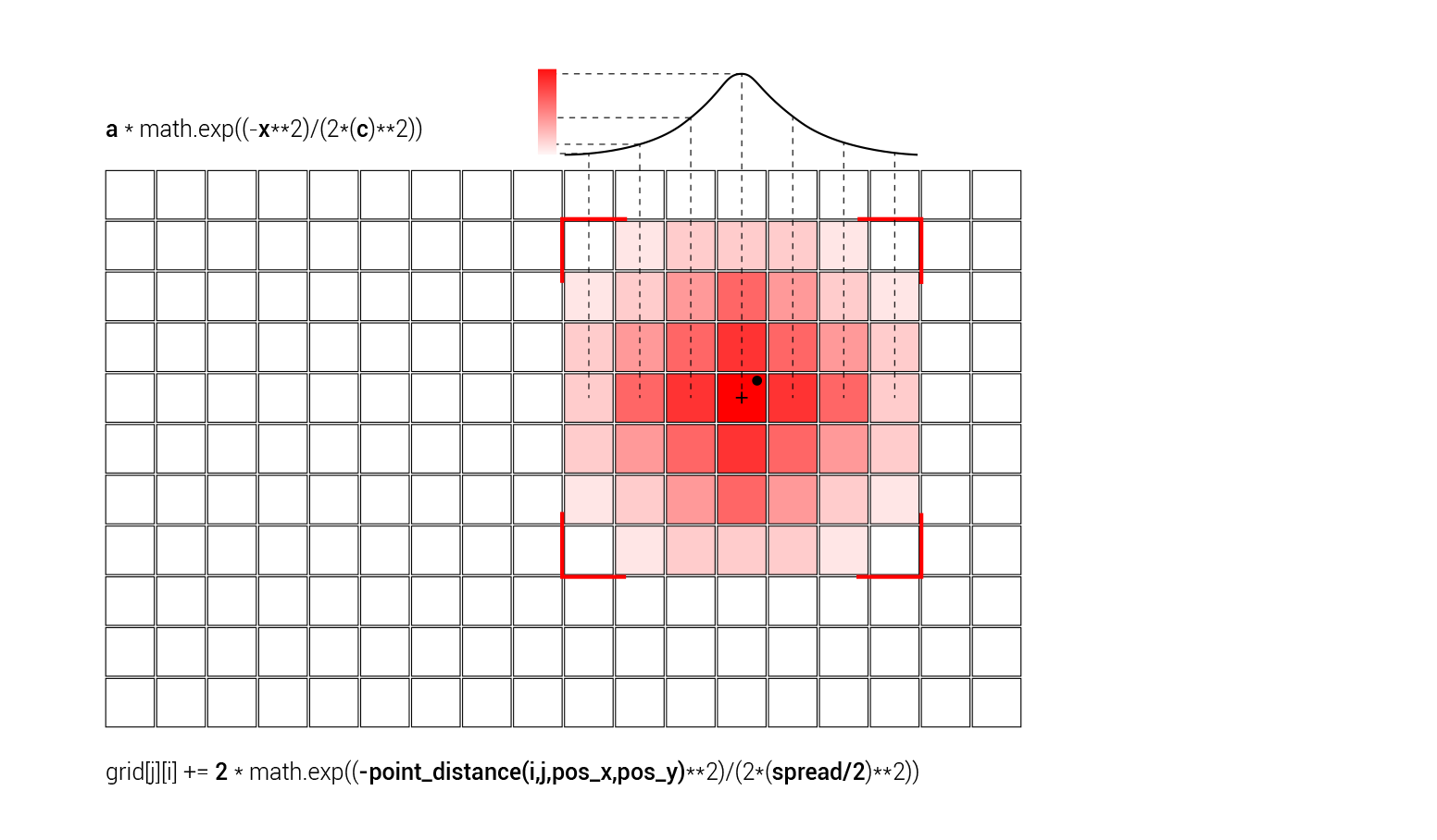
grid[j][i] += 2 * math.exp((-point_distance(i,j,pos_x,pos_y)**2)/(2*5**2))
The first line iterates through all the records stored in the ‘records’ list, and puts each one into a variable called ‘record’ which we can reference within the loop. The next two lines use the remap() helper function we defined earlier to figure out the position of the feature point within the analysis grid. We do this by remapping the latitude and longitude of the feature from the initial range represented by the minimum and maximum latitude and longitude of the browser window (stored in the lat1/lat2, lng1/lng2 variables) to the target range represented by the dimensions of the grid (stored in numW and numH). Since latitude increases from bottom to top while the numbering of the grid rows starts from the top, we have to flip the target range in the latitude case. Now the lower latitude values (closer to the bottom of the screen) will be mapped properly to higher row numbers (which increase toward the bottom of the screen as well). If you don’t do this the analysis will be flipped vertically on the screen.
Now that we have the location of the feature in the grid, we can iterate through the grid and add heat to the cells based on their distance from the feature. To control the effect that distance has on the heat added to the cells of the analysis grid, we create a new variable called ‘spread’. This variable can be given a different value for each record, and could be used to control the relative effect that each record has on the heat map. In our case, we will set this value as a constant 15 for each record, which specifies that each record will affect the grid cells within a radius of 15 grid cells around it.
Next we create a double loop to iterate over all the grid cells around the record and add heat to the cells by incrementing the value stored in the corresponding place in the ‘grid’ list. To speed up the calculation we limit the two loops to only look at cells within the range specified in the ‘spread’ variable. In the outer loop, we will be looking at all the rows starting from 15 less than the position of the record, to 15 more. For example, if the current record is located within the 23rd row, we will only look from row 8 (23-15) to row 38 (23+15). To make sure we don’t reference any rows that don’t exist in the grid, we use the max() and min() function to limit the range so that it is never lower than 0 and is never larger than the number of rows in the grid. We put these minimum and maximum row indexes into the range() function, which gives us a list of indexes starting from the minimum and ending at the maximum. In the inner loop, we use the same logic to iterate over the columns of the grid within the range set by the ‘spread’ variable.

Within this double loop, we perform the actual calculation that increments the ‘heat’ stored in each grid cell with a value based on that cell’s proximity to the record. We will base this calculation on the Gaussian function, which creates a smooth transition from the highest value which occurs at zero distance, to lower values as the distance increases.
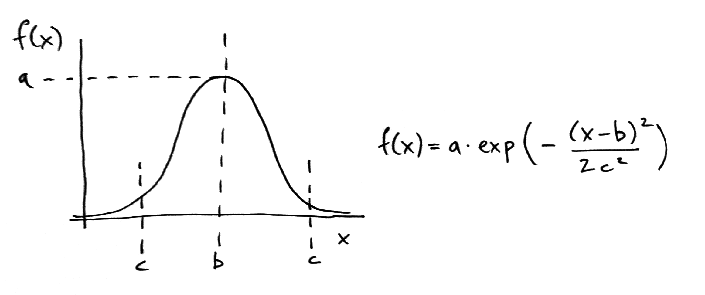
Mathematical description of Gaussian function (Wikipedia).
In the Gaussian function, the ‘a’ constant controls the height of the curve (and fhus specifies the highest possible value). We can set this value arbitrarily to 2 (since we will eventually normalize all the values we only care about relative values, not the total amount). The ‘b’ constant controls the center of the peak of the curve, which we keep at 0 to make sure that the heat is centered on the feature point. The ‘c’ constant controls the width of the curve, which we set to be a multiple of the ‘spread’ variable. This will allow us to control the diffusion of heat in the heat map by changing this ‘spread’ variable.
For the ‘x’ variable in the function, we pass the distance between the location of each grid cell (represented by i and j) and the record feature (represented by pos_x and pos_y). To calculate the distance we use the point_distance helper function we wrote earlier. We then increment the value of the current grid cell (represented by grid[j][i]) by the value coming out of this function using the ‘+=’ operator. For the purpose of this class, you do not have to understand how the Gaussian function works, but you should understand how you can tweak its parameters to create different distributions of heat in the heat map based on the density of the features in the dataset.
Once we iterate over all the records and add heat to the affected grid cells, we will use the normalizeArray() helper function we wrote previously to normalize the whole ‘grid’ list to make sure that the lowest value in the analysis grid will be 0 and the highest value will be 1. On the following line, type:
grid = normalizeArray(grid)
Now that we have a grid with heat values corresponding to the density of features on the map, we can use these values to set the value of the analysis grid cells being sent back to the client. A few lines down in the code, find the line that reads:
newItem['value'] = .5
This line is currently setting the value of each analysis grid cell to a default of ‘.5’. Let’s change this to get the value of the corresponding cell from the ‘grid’ list. Change this line to read:
newItem['value'] = grid[j][i]
Now the value in the analysis grid will match the heat values we generated earlier, with higher heat values representing a higher density of feature points. Notice that since we normalized the list of heat values to be in the range from [0, 1], our color range on the client side will still work, with a value of 0 creating the least saturation, and a value of 1 creating the most saturated red.
Save the app.py file and start the server by running the app.py file in the Command Prompt or Terminal, or within a Canopy session. Make sure you also have your OrientDB server running, and have changed the database name and login information in the app.py file to match your database. Go to http://localhost:5000/ in your browser. You should now see the same analysis grid, but this time the grid should be more red in areas with larger concentrations of record features, and less red in areas of lower concentrations. Go back to the app.py file and experiment with different settings for the ‘spread’ variable, to see how this effects the distribution of heat in the overlay.
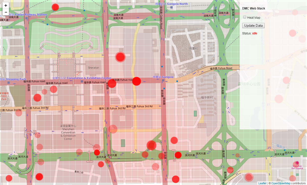
Working with color
The heat map is working, but it is a bit hard to see the variation in the red color. To create a more legible visualization, let’s go back to the client side code, and change the way that color is assigned to the grid rectangles. Open the script.js file within the /static folder in a text editor, and find the line that reads:
.attr("fill", function(d) { return "hsl(0, " + Math.floor(d.value*100) + "%, 50%)"; });
This line is using the hsl() function to allow the ‘value’ parameter of each grid cell to control the saturation of the red color. Let’s change this line to read:
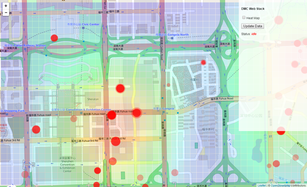
.attr("fill", function(d) { return "hsl(" + Math.floor((1-d.value)*250) + ", 100%, 50%)"; });
This code again uses the hsl() function, but now uses the ‘value’ parameter to control the hue of the color while setting the saturation to a constant 100%. Since the ‘value’ data is normalized to the range [0, 1], we can multiply this value by 250 to create a range of colors from the hue 0 (which represents red) to a hue 250 (which represents blue). To associate the higher values with red and the lower values with blue (which is more intuitive), we subtract the value from 1 (which effectively flips the range). Save the file and reload http://localhost:5000/ to see the new visualization.
Implementing the checkbox
To finish up our implementation of the analysis overlay, let’s add functionality to the ‘Heat Map’ checkbox we created earlier to allow it to control whether the analysis is executed after the data query, and whether it is visualized in the client’s browser. To do this we will add one more argument to the query string that is sent with the request to the server. This argument will be a boolean value which specifies whether the ‘Heat Map’ checkbox is checked. The server will then use that boolean to control whether the analysis is performed after the data query. We will also use this boolean in the client code to control whether the rectangle geometry is visualized. Open the script.js file again and find the line that reads:
request = "/getData?lat1=" + lat1 + "&lat2=" + lat2 + "&lng1=" + lng1 + "&lng2=" + lng2 + "&w=" + w + "&h=" + h + "&cell_size=" + cell_size
This is the current request we are sending to the server. Let’s add another line before the request to check whether the checkbox is checked, and store this value in a new variable:
var checked = document.getElementById("heat map").checked
Here we are using the ‘document’ object, which stores a reference to our entire HTML page. We are then using the document’s .getElementById() method to locate the checkbox (remember that when we created it in the HTML code we assigned it an id of “heat map”). Finally, we access the checkbox’s .checked property to see if the checkbox is currently checked. This property will return a boolean value (either true or false), which we store in a new variable called ‘checked’.
Now that we have this information, let’s append it to the end of the request being set to the server. Find the request line again, and change it to read:
request = "/getData?lat1=" + lat1 + "&lat2=" + lat2 + "&lng1=" + lng1 + "&lng2=" + lng2 + "&w=" + w + "&h=" + h + "&cell_size=" + cell_size + "&analysis=" + checked
You can see that we added a new argument called ‘analysis’ to the query string, and assigned it to the value of the variable ‘checked’. Still in the script.js file, let’s use this boolean value to control whether the rectangle geometry is generated after the data comes back from the server. Find the block of code that starts with:
var topleft = projectPoint(lat2, lng1);
and ends with:
.attr("fill", function(d) { return "hsl(" + Math.floor((1-d.value)*250) + ", 100%, 50%)"; });
This is the code that generates the rectangle geometry for the analysis overlay. To make sure that this code runs only when the heat map is active, wrap the entire block of code in a conditional that checks the value of the ‘checked’ boolean. The whole block of code should now look like this:
if (checked == true){
	var topleft = projectPoint(lat2, lng1);

	svg_overlay.attr("width", w)
		.attr("height", h)
		.style("left", topleft.x + "px")
		.style("top", topleft.y + "px");

	var rectangles = g_overlay.selectAll("rect").data(data.analysis);
	rectangles.enter().append("rect");

	rectangles
		.attr("x", function(d) { return d.x; })
		.attr("y", function(d) { return d.y; })
		.attr("width", function(d) { return d.width; })
		.attr("height", function(d) { return d.height; })
    	.attr("fill-opacity", ".2")
    	.attr("fill", function(d) { return "hsl(" + Math.floor((1-d.value)*250) + ", 100%, 50%)"; });
};
Now the rectangles will only be created if the ‘Heat Map’ checkbox is checked and the value of the ‘checked’ boolean is ‘true’. If you don’t implement this conditional, JavaScript will generate an error when it tries to create the rectangle geometry based on grid data that is not being returned from the server.
Now let’s implement functionality on the server so that the heat map analysis is only performed when the ‘Heat Map’ checkbox is checked. Open the app.py file from the main repository directory in a text editor and find the line that reads:
cell_size = float(request.args.get('cell_size'))
This is the last in a series of lines which extract the arguments being sent through the request to the server. Directly below this line add a new line to extract the status of the checkbox that is passed through the ‘analysis’ argument:
analysis = request.args.get('analysis')
Since in this case we are sending a string, we do not have to wrap it in the float() function.
Now the variable ‘analysis’ is storing the value of the checkbox on the client side, ‘true’ if the checkbox is checked, and ‘false’ if it is not. To have this value control the execution of the analysis code, we will create a conditional before the analysis starts which will check the value of the ‘analysis’ boolean and return the dataset directly to the server if the variable is ‘false’. This will cause the function to terminate, effectively skipping the remainder of the function which contains the heat map analysis. In the app.py file, find the line that reads:
q.put('starting analysis...')
This message marks the beginning of the heat map analysis code. Directly before this line, add the following lines of code:
if analysis == "false":
	q.put('idle')
	return json.dumps(output)
This conditional checks the value of the ‘analysis’ boolean. If its value is ‘false’, meaning that the ‘heat map’ checkbox is unchecked, the code places the ‘idle’ message in the queue, signifying that the server process is complete, and returns the data stored in the ‘output’ dictionary back to the client. Thus the heat map analysis is skipped, and no analysis data is sent back to the client. If you save the file and reload http://localhost:5000/, you will see that the analysis overlay is not initially visualized, since the checkbox is unchecked by default. However, if you check the ‘Heat Map’ checkbox and click the ‘Update Data’ button, you will see that the analysis is performed on the server, and the heat map is visualized in the browser.
Our implementation of the analysis overlay is now complete, along with a very basic heat map analysis. In the next set of tutorials we will start to explore the application of Machine Learning on the back-end server, which will allow us to perform much more complex and interesting types of analysis. For now, switch to the 04-assignment branch in the ‘week-5’ repository. This branch contains the final version of the app.py and script.js files against which you can check your own work. It also contains some instructions within the comments which you should follow to test your new knowledge. Remember to submit a pull request with your changes before the next deadline.
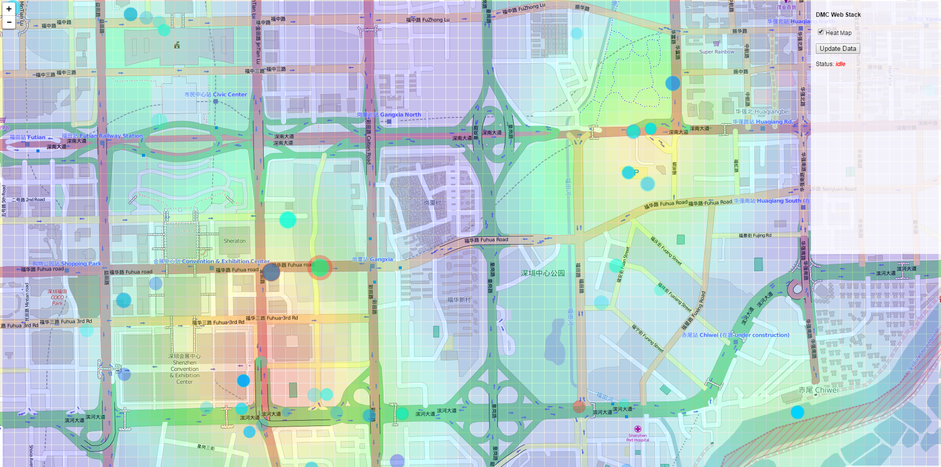
The final heat map and overlay implementation after implementing circle coloring for the assignment