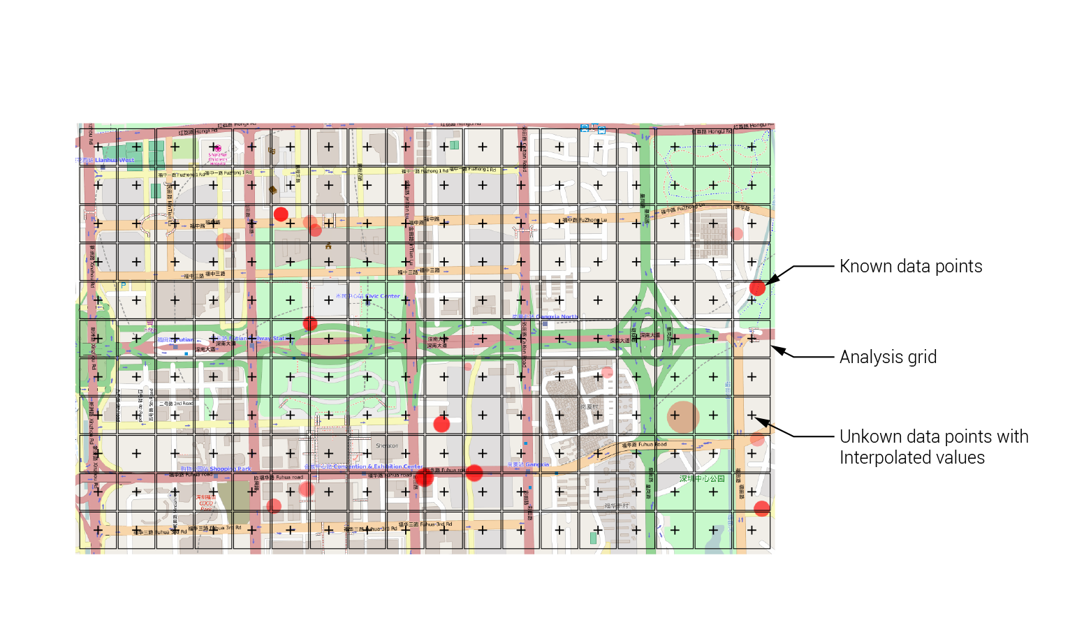
Creating an analysis overlay
What is modeling?
At this point, we have developed most of our basic Web Stack functionality. Our system contains a database, a server side which can query the database for data, and a client side which can understand user input, make requests to the server, and visualize the information it gets back to the user interface. Pretty cool!
In the next set of tutorials, we will start to implement some features to process our data and use it to create new data. The process of creating new data from existing data is called ‘modeling’. A model uses a finite set of known data to develop a representation of how the underlying system that created the data works. Once this model is developed, it can then be used to predict new data points which are not yet known. A simple example of a model is the formula ‘F = ma’, Newton’s second law of motion which describes the relationship between an object’s mass and acceleration, and the force that was applied to it. Before this formula was known, values for each of these three variables might have been gathered by experimenting with different objects. Once enough data was gathered, you (if you were as smart as Isaac Newton) might have seen a relationship between the three values that was perfectly described by the equation ‘F = ma’, which is the model that describes how the underlying system of motion works. Once you have this model, you can use it to describe the behavior of objects that you have not yet tested. For example, you might take an object of a known weight, and predict how fast it will accelerate when a given force is applied to it.
The class of models we will explore in this class fall under the category of ‘Machine Learning’. These are highly complex models often used to describe systems that cannot be easily represented by an equation. Instead, they are described by an abstract computational structure, and utilize a system of ‘training’ to model a given set of data. Once the model is trained with a sufficient amount of known data, it can be used to predict information about unknown data. One very common example of these models are recommender systems, which are used by websites like Netflix.com and Amazon.com to predict what the customer will want based on past purchases and the purchases of other similar customers. Another common use in geo-spatial analysis is spatial interpolation, which tries to estimate the properties of unsampled sites within an area covered by existing observations. For example, if we have a collection of data about housing prices in various points within a city, we can use Machine Learning to predict what the price will be at other locations in the city where we don’t have actual samples.
Since many applications in geospatial analysis deal with predicting the values of certain properties over space, it is helpful to have a standard geometry that we can use to visualize these values. For this purpose it is common to use a regular square grid, which creates an ‘overlay’ over the map to visualize the data at a given resolution. To create this overlay, we first train the model using a finite set of data points within our study area. Then, the coordinates of each cell in the regular grid overlay are fed into the model, and the value is predicted for each grid location. Finally, the color of each cell is used to represent the value of that location, creating a visualization of the value across the space.
Building the analysis grid
In this tutorial we will build a graphic overlay within our client side code and connect it to our back end server so it can send information about the data to be visualized. We will then use this overlay to visualize the results of data processing and Machine Learning applications in later tutorials. Switch to the 02-analysis-overlay branch in the ‘week-5’ repository. This branch contains our current implementation of the Web Stack, including the refactoring work done in the previous tutorial.
Let’s start by creating the graphic portion of the overlay. Open the script.js file within the /static folder in a text editor. The first step will be to create a new ‘svg’ container and ‘g’ group to hold our rectangle geometry. These new elements will be very similar to the ones created to hold the circle geometry, and can be added to the code directly above them. Find the line that reads:
var svg = d3.select(map.getPanes().overlayPane).append("svg");
This is the line that creates the svg for the circles. Directly above it, type the lines:
var svg_overlay = d3.select(map.getPanes().overlayPane).append("svg");
var g_overlay = svg_overlay.append("g").attr("class", "leaflet-zoom-hide");
You can see that these lines are very similar to the two below. They specify a new ‘svg’ element called svg_overlay which will contain the graphic elements of the overlay, and a new ‘g’ group called g_overlay which will group the actual rectangle geometries.
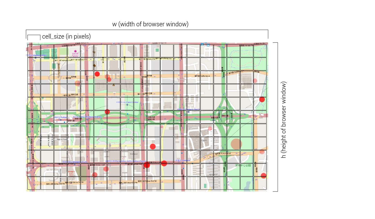
Now that we have the basic containers for our overlay geometry, we need to send some information to the backend server, which will specify the size and location of the overlay grid, and attach to each cell the data to be visualized. To create the overlay grid, the server will need to know the width and height of our browser window, as well as the resolution of grid we want. In this case we will specify the size of each grid square in pixels, and let the server figure out the total resolution of the grid. To pass this information to the server, we will modify the request string that is sent to the server within the updateData() function. In the script.js file, find the line that reads:
request = "/getData?lat1=" + lat1 + "&lat2=" + lat2 + "&lng1=" + lng1 + "&lng2=" + lng2
This is the current request being sent to the server every time the updateData() function runs. At this point it is only sending the latitude and longitude ranges of our current browser window, which the server is using to query the data points. Let’s create a few new variables to store the dimensions of our browser window as well as our desired grid cell size, and then modify the request to send this information to the server. Replace the line above with the following lines of code:
var cell_size = 25;
var w = window.innerWidth;
var h = window.innerHeight;

request = "/getData?lat1=" + lat1 + "&lat2=" + lat2 + "&lng1=" + lng1 + "&lng2=" + lng2 + "&w=" + w + "&h=" + h + "&cell_size=" + cell_size
The first line specifies that we want each square in the grid to be 25 pixels in size. The next two lines use the handy window.innerWidth and window.innerHeight functions to get the current width and height of the browser window and store them in two new variables. We will use these variables to tell the server how big to make our grid. We will also use them later to resize the svg_overlay element so that it always matches the dimensions of our screen. Finally, we append these three variables to the query string of our request to send this information to the server.
Building the grid in Python
Now that the client end is sending the proper information, let’s go to the server code to implement how the analysis overlay grid will actually be created. Open the app.py file from the main repository directory in a text editor. In the imports area at the top of the file, let’s import the math library, which contains some useful functions we will use for calculating the size of our grid. Find the line that reads:
import random
and on the next line type:
import math
Next, let’s modify the getData() function within our main “/getData/” route to receive the screen dimensions and grid cell size data from the server, and use them to define the grid. Find the block of lines that read:
lat1 = str(request.args.get('lat1'))
lng1 = str(request.args.get('lng1'))
lat2 = str(request.args.get('lat2'))
lng2 = str(request.args.get('lng2'))
These are the lines that read in the arguments included in the query string of the incoming request (if you don’t remember how this works you can review the previous tutorial about arguments and query strings). Under these lines, let’s add three more lines to read in the browser window dimensions and cell size data from the request, and set them to new variables we can use in our code:
w = float(request.args.get('w'))
h = float(request.args.get('h'))
cell_size = float(request.args.get('cell_size'))
Now let’s generate the data that will define the location and size of each cell in the overlay grid, and attach this information to the data being passed back to the client. We will do this at the very end of the getData() function, right before the last return statement which sends the data back to the client. Find the line that reads:
q.put('idle')
This is the message that marks the end of the data query. Since we will now proceed with the analysis, change this line to read:
q.put('starting analysis...')
Then, after this line, add a new line to extend the output dictionary (which is storing all the data being passed to the client) to contain data about our analysis grid:
output["analysis"] = []
This adds a new key to the dictionary called “analysis”, which references an empty array. To this array we will add individual elements which will represent the size, location, and data value of each square in the analysis grid. This data will then be used on the client side to create the actual square objects using D3.
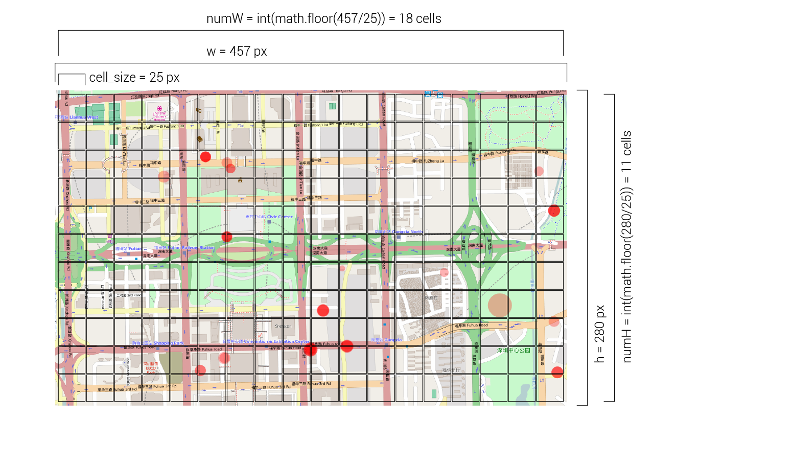
To generate the grid we first need to calculate the number of grid cells we will have along the width and height of the screen, using the window dimensions and cell size data we received from the client:
numW = int(math.floor(w/cell_size))
numH = int(math.floor(h/cell_size))
To get these dimensions, we divide the total width and height of the screen (stored in the ‘w’ and ‘h’ variables) by the target size of each cell. Since this division will probably not result in a whole number, we use the math.floor() function from python’s math library to round the number down to the closest integer. We also wrap the calculation in a int() function to ensure that the data is stored as an integer.
Now we are ready to generate the data for all the cells in our analysis grid. To do this we will use a double loop to iterate through each row in the grid, and each cell within each row:
for j in range(numH):
	for i in range(numW):
		newItem = {}

		newItem['x'] = i*cell_size
		newItem['y'] = j*cell_size
		newItem['width'] = cell_size-1
		newItem['height'] = cell_size-1
		newItem['value'] = .5

		output["analysis"].append(newItem)
In the outer loop, we are using the range() function to create a list of indexes for the rows in our grid (remember that the total number of rows is stored in the numH variable). The inner loop is doing the same thing but along the other dimension of the grid. So, for each iteration of the outer loop, the inner loop iterates over each cell in that row. While we are within both of these loops, the ‘j’ variable stores the index of the current row, while the ‘i’ variable stores the index of the current column. We can use these variables to generate the data for each cell in the grid.
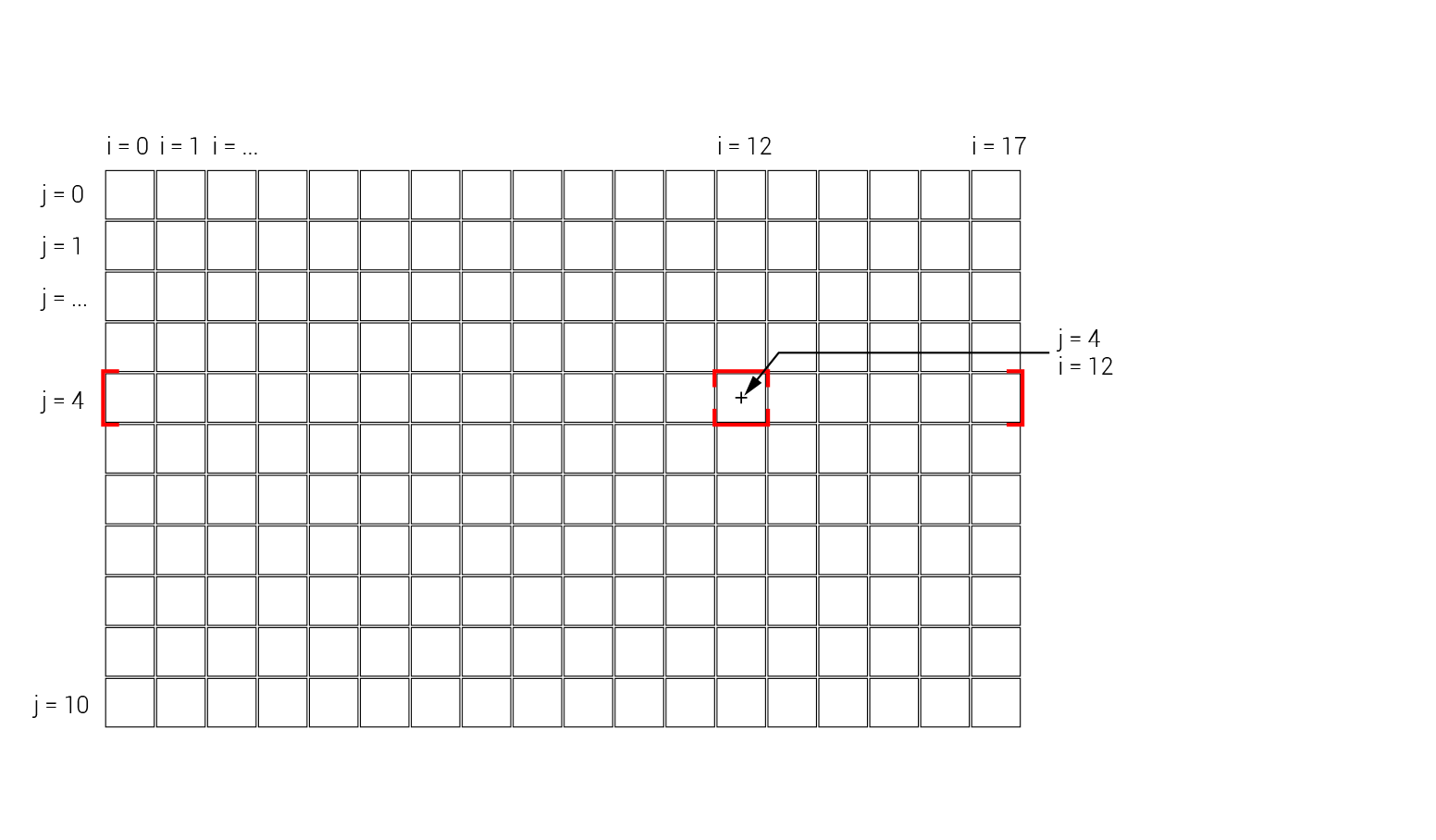
Within the double loop, we create a new blank dictionary which will store all the data for that cell, including its location, size, and value for visualization. To store the cell’s location on the screen we add two new keys, ‘x’ and ‘y’, to the ‘newItem’ dictionary and calculate the location based on the position of the cell and the size of the cells. For example, if the current cell is in the column with index 12, its ‘x’ position can be found by multiplying the number of columns before it (12) by the width of each column (the size of the cell stored in teh cell_size variable).
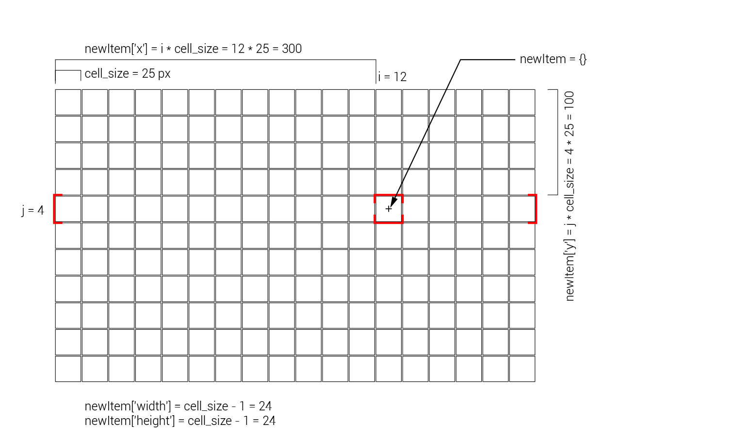
To store the size of each cell, we add new ‘width’ and ‘height’ keys tothe ‘newItem’ dictionary. For visualization purposes, we will set the size of the cell to one pixel less than what was specified. This will create a one pixel boundary between all the cells, and make the individual cells easier to see. Finally, we add a ‘value’ key to the dictionary which will store the value associated with each grid cell. In future tutorials we will implement different analyses which will generate this value for each cell. For now, we will set each cell to a constant value.
Once all the data for the cell has been set, we append the new cell dictionary to the empty list under the “analysis” key in the “output” dictionary we specified earlier. Now, when the “output” dictionary is returned to the client on the final line of the getData() function, the grid information will be sent back to the client along with the information about the property listings. To finish our server code, on a new line after this double loop, add a new message to the message queue which communicates that the server side process is complete:
q.put('idle')
Visualizing the grid in D3
Now that the grid data is being sent back to the client, let’s go back to the client code and implement the actual visualization of the grid in D3. Open the script.js file within the /static folder in a text editor. Just as we did with the circles, we will implement the code to visualize the analysis grid within the d3.json() function, which sends the request to the server and modifies the visualization geometry according to the data that it gets back.
After the request is sent and the data is returned, the first thing we need to do for our analysis overlay is to modify the location and size of the ‘svg’ element that is containing it. Since the grid is being generated according to the current size of the browser window, we need to make sure that the canvas containing the visualization geometry also matches the dimensions of the window, and is placed in the proper location relative to the map. Within the d3.json() function, after the code which creates the circles but before the update() function (this should be around line 90 in the code), add the following lines of code:
var topleft = projectPoint(lat2, lng1);

svg_overlay.attr("width", w)
	.attr("height", h)
	.style("left", topleft.x + "px")
	.style("top", topleft.y + "px");
The first line uses the projectPoint() function specified earlier to convert the latitude and longitude of the top left corner of the map (stored in the lat2 and lng1 variables) to screen coordinates. These coordinates will be used to move the svg container of the analysis overlay to match the top left corner of the screen. The following four lines of code use method chaining to modify the location and size of the svg_overlay container to match the current dimensions of the screen. We use the .attr() method to change the width and the height of the svg to match the screen dimensions (remember that we stored these in the ‘w’ and ‘h’ variables earlier in the tutorial). We then use the .style() method to align the svg’s top left corner with the top left corner of the screen using the ‘topleft’ variable we created earlier.
Now that the svg container is properly sized and positioned, we are ready to create the actual geometry of the grid. On the following lines, type:
var rectangles = g_overlay.selectAll("rect").data(data.analysis);
rectangles.enter().append("rect");
This code creates a new variable called ‘rectangles’ to store a reference to our visualization geometry, which will use a rectangle shape (called ‘rect’ in svg) to represent each cell in the grid. Within the ‘g_overalay’ group object, we select all objects of type ‘rect’ using D3’s .selectAll() method. Since there are no rectangles yet drawn, this selection will initially be empty. However, this selection will tell D3 where we want our rectangle geometry to be located once it is created by the data. Once we have the selection, we ‘join’ it to the data we receive from the server with the .data() method. Into this method we pass the ‘analysis’ portion of the returned data (accessed through the ‘.’ operator), which contains the data about each grid cell we generated earlier.
On the next line we use the .enter() selection to reference all the data which has not yet been assigned to a piece of geometry, and use the .append() method to add a ‘rect’ object for each of these unassigned data points. You can see that this process is very similar to the one used for circles in the previous code. If you need to refresh your memory on the data ‘joining’ process in D3, you can look back at the previous tutorial.
Now that the data is bound to the rectangle geometry, and a rectangle has been created for each data point, we can change the dimensions, position, and color of the rectangles based on the grid cell data coming back from the server. On the following lines, type:
rectangles
	.attr("x", function(d) { return d.x; })
	.attr("y", function(d) { return d.y; })
	.attr("width", function(d) { return d.width; })
	.attr("height", function(d) { return d.height; })
	.attr("fill-opacity", ".2")
	.attr("fill", function(d) { return "hsl(0, " + Math.floor(d.value*100) + "%, 50%)"; });
Here we use the ‘rectangles’ variable that is storing a reference to the rectangle geometry, and chain together a sequence of .attr() methods to set various properties of the rectangles according to the data bound to each one. In each case we use an anonymous function to access the data bound to each rectangle and place it in a temporary variable called ‘d’. This ‘d’ variable contains the size, location, and value data we created when we generated the grid on the server. To specify the location of each cell, we set its ‘x’ and ‘y’ attribute to the ‘x’ and ‘y’ values in the data. We then do the same thing to set the width and height of each cell. For the color of the cells, we first set the transparency to 20% to make sure we can still read the map underneath.
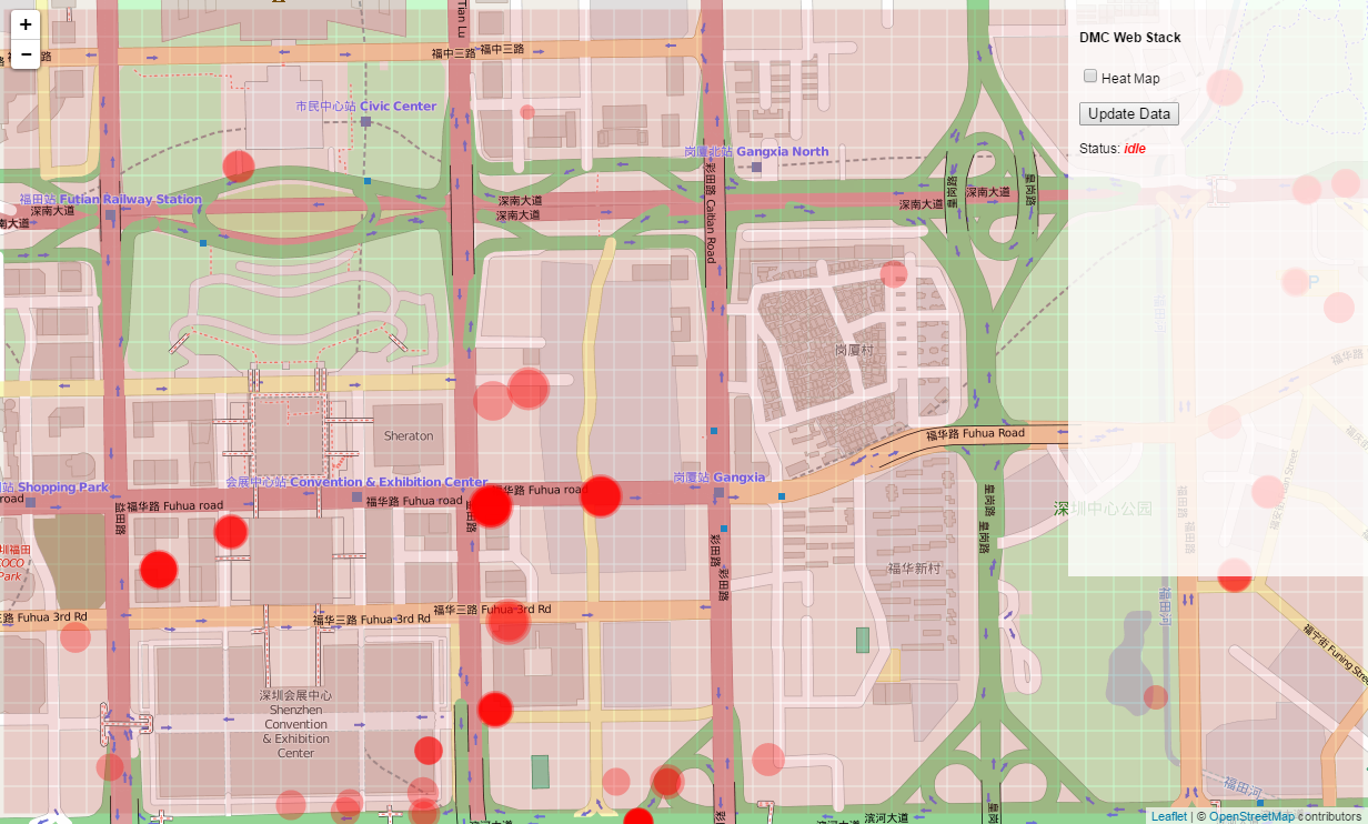
Finally, we set the color of each cell using the hsl() function, which lets us specify a color according to its hue, saturation, and lightness. In our case, we will set the hue to 0, which is on the red side of the spectrum. We will then use the ‘value’ parameter of the cell (which will be in the range of 0-1) to control the saturation of the red color (which is in the range of 0-100%) by multiplying the d.value data bound to the rectangle by 100. Since the hsl() function expects whole numbers, we will also wrap this calculation in the Math.floor() function, which rounds the value down to the closest whole number. Finally, we will set the lightness to a constant 50%. Since right now we are returning a constant value of .5 for each grid cell, our grid will be an even red color. However, when we implement our first analysis in the next tutorial, this color will allow us to visualize the results in a gradient from gray to bright red.
Save both the app.py and script.js files and start the server by running the app.py file in the Command Prompt or Terminal, or within a Canopy session. Make sure you also have your OrientDB server running, and have changed the database name and login information in the app.py file to match your database. Go to http://localhost:5000/ in your browser. You should now see a light red grid generated over the map once the data request has finished.
If you pan the map you see that the overlay moves with it. This works because the svg_overlay element that contains the rectangle geometry is attached to leaflet’s ‘overlay’ layer, which makes sure that the overlay geometry stays in the right place relative to the map. If you pan the map or resize the browser window and then click the ‘Update Data’ button, you will see that the overlay updates to the location and size of the current map view. This is also the desired behavior, and works because we are updating the size and relative position of the svg_overlay element each time the updateData() function is run.
However, if you now zoom in or out of the map, you see that the analysis grid stays the same size on the screen, and is no longer tied to the map. This is because we have not implemented any code for the grid within the update() function, which runs when the data is first loaded, as well as whenever the map view is reset, for example when the zoom level of the map is changed. In the case of the circles, we actually wrote code in this function to alter the size and location of the containing ‘svg’ and ‘g’ elements to change according to the zoom level. This is why the circle geometry stays bound to the map as we zoom. We could do the same for the rectangles, but since this is an overlay it might be strange to keep it active as the map is zoomed in and out. So instead, let’s just remove all the rectangles whenever the map is zoomed to hide the overlay when this happens.
Open the script.js file again and find the line that says:
function update() {
This is the function which is triggered to run whenever the view is reset. On the next line, within the function definition, write the line:
g_overlay.selectAll("rect").remove()
This will select all of the ‘rect’ elements within the ‘g_overlay’ group and remove them. Now, whenever this function runs, all of the rectangle elements will be removed from the map, thus hiding the overlay. However, if you save the file and reload http://localhost:5000/, you will see that the overlay does not appear at all. This is because currently the update() function is called at the very end of our script, after all the circle and rectangle geometries have been created. So although the rectangles are created earlier in the script, they are all removed once this function is run. To fix this, let’s move the code where we call the update() function from the end of the script, to a location after the circles are created, but before the rectangles are created. In the script find the lines:
update();
map.on("viewreset", update);
They should be somewhere around 138 in the code. Copy and delete the lines from the code, and paste them around line 91, right after the circles are initially created. Now, since the code to create the rectangles runs after this function, they will not be removed when the data is initially returned from the server. However, if the update() function is triggered because of a zoom event, the rectangles will be removed from the screen, thus hiding the overlay.
If you get lost writing or editing this code, you can commit your changes and switch to the 03-server-side-analysis branch in the ‘week-5’ repository, which has the final implementation of the analysis overlay grid. In the next tutorial, we will implement some basic analysis on the server, and represent the results of the analysis using this overlay grid.