Interactions in D3
Now that we have set up our basic Web Stack, we can start to develop features that will enhance the user experience on the client side. One of the great advantages of using JavaScript and D3 in a web-based framework is that it can handle user interactions and input very easily in a variety of ways. To test some of the basic possibilities of user interaction we will develop a tooltip that will display information about data points when the user hovers over them. You can then extend these basic ideas to develop user interactions that are specific to your project. To start, fork and clone the ‘week-4’ repository from the DMC Github page and switch to the 01-interactions branch. This branch contains the basic Web Stack implementation we have developed so far.
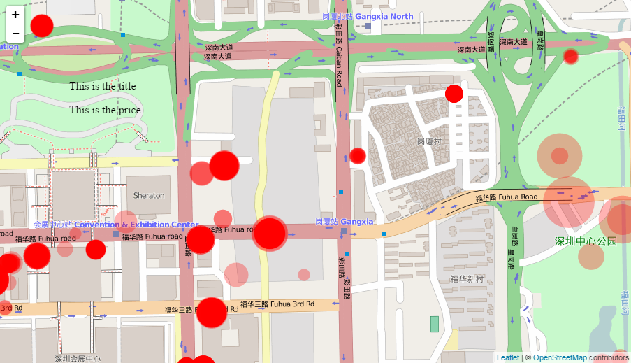
Our basic tooltip will be a text box that displays information about a property listing’s title and price. Let’s start by creating the text box somewhere on the page and styling it to get the look we want. We will then use mouse interactions to change its position and visibility, and change the text dynamically according to the data.
Using a text editor such as Sublime, open the index.html file in the repository’s /templates folder. In the main <body> section of the document, under the line that specifies the container for the map (<div id="map"></div>), let’s create a new basic container for the tooltip:
<div class="tooltip" style="position: absolute; z-index: 10; top: 100px; left: 100px">
	<p class="tooltip-text" id="title">This is the title</p>
	<p class="tooltip-text" id="price">This is the price</p>
</div>
This creates a new <div> container to hold our tooltip, to which we assign the class “tooltip” so we can refer to it later in our styling rules and JavaScript code. We also define a few ‘style’ parameters that will control how the container is displayed on the page. We set the ‘position’ to absolute so that it is not influenced by any other elements on the page, the ‘z-index’ to 10 to ensure that it stays on top of all other elements, and the ‘top’ and ‘left’ parameters to 100px to move it down and to the right on the page. These parameters use the same CSS syntax we used earlier to control the style of the page and circle elements, but in this case we are adding the CSS code directly “inline” within the HTML code. Although using CSS “inline” is handy for quick styling of individual elements, it can become hard to keep track of, and for clarity you should eventually pull out the CSS code into the main CSS section in the <head> of the document or an external .css file, as we will do later in this tutorial. For a description of the different ways in which you can integrate CSS code into a website you can consult this reference.
Within the <div> tag we place two <p> or ‘paragraph’ elements which will contain the text we want to show. We assign them both a class of “tooltip-text” so we refer to them later in the styling rules, and give them each a unique id so we can later find them with JavaScript code. At this point you may be wandering about the difference between a ‘class’ and ‘id’, since we can use them both to identify elements in the document for dynamic coding and styling. The main difference is that classes can and should be used over and over to identify any number of elements in the document that share the same properties, while an ‘id’ should be unique to only one element. In this case, we will only have one <div> object with class “tooltip”, so we can use the class to both style it and uniquely identify it in the JavaScript code. On the other hand, we have two <p> objects to which we want to assign the same style but identify separately in JavaScript. Therefore we assign them both the same class which we will reference in the styling rules, but give them unique id’s which we will use to identify them separately in JavaScript. When you use ‘classes’ vs. ‘ids’ will vary on a case by case basis and often depends on the particular application, but you should try to follow these basic rules whenever possible.
Within the two <p> </p> tags we place some placeholder text so we can see what the tooltip will look like. Save the index.html file. Then, execute the app.py file either by navigating to the main repository folder in a Command Prompt or Terminal window and typing python app.py, or by opening the file in a session of Canopy and clicking the green ‘run’ button. Finally, navigate to localhost:5000 in your web browser to see our progress so far.
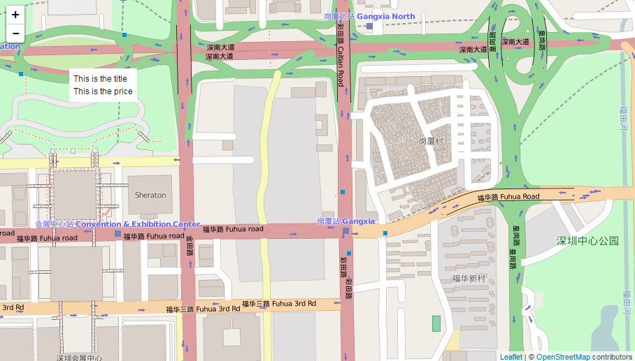
You will see the two lines of text floating somewhere near the top left corner of the page. Let’s add some styling rules in the <head> section of the page to control the look of the tooltip. Within the <style> </style> tags, below where we defined the styling rules for the circles, add the following styling rules:
div.tooltip{
	padding: 6px;
	background: white;
}
p.tooltip-text{
	margin: 0px;
	padding: 0px;
}
This will give the tooltip’s main <div> container a white background, and specify a set buffer or ‘padding’ around the text. For the <p> elements, setting the margin and padding to ‘0px’ will pull the text closer together. This code attaches styling rules to the <div> and <p> tags, and species which class the rules should apply to using the ‘.’ syntax. If we did not specify the classes using the dot the rules would apply to all <div> and <p> tags, which is not what we want.
Let’s also set the global font properties for the whole page by adding a few rules to the styling of the ‘body’ element. Within the ‘body’ section of the styling rules, add three more rules so the whole section looks like this:
body {
    padding: 0;
    margin: 0;
    font-family: Helvetica, Arial, sans-serif;
	font-size: 12px;
	line-height: 18px;
}
The third line of this set of rules specifies the type of font we want to use, in the order of our preference. In this case, the browser will try to use Helvetica first. If it is not available on the user’s system, it will use Arial. If both are not available, it will use the default sans-serif font. The next line specifies the font size we want to use, and the last line specifies the height between lines of text. You can change these parameters to get the look you want for the tooltip.
Now let’s make the tooltip interactive by referencing it in the JavaScript code and making it respond to user input and the data loaded from the server. At the top of the <script> section, before the declaration of the ‘map’ variable, let’s declare three new variables that will store references to our tooltip and its text:
var tooltip = d3.select("div.tooltip");
var tooltip_title = d3.select("#title");
var tooltip_price = d3.select("#price");
Notice here that we are referencing the tooltip’s main <div> container using its class through the ‘.’ syntax, while we are referencing the two <p> text fields individually by their unique tags using the ‘#’ syntax. Which method you use is up to you but be aware that if there are more than one element that belongs to a certain class, D3’s `.select()’ method will only select the first one. So you can see why, if you have more than one element that belongs to a particular class, unique id’s come in handy for identifying specific features.
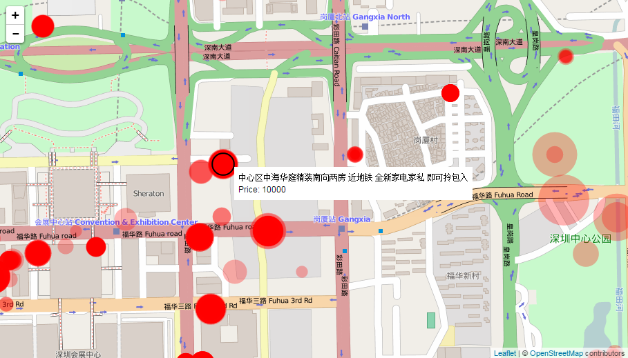
Now let’s implement how the tooltip should respond to user input. We can start to think about it by breaking our desired interaction down to a few basic features:
- When user ‘hovers’ their mouse cursor over a data point (circle), the tooltip should appear next to the cursor and the text in the tooltip should change to display the title and price of that data point.
- As the mouse cursor moves over the circle, the tooltip should follow the cursor.
- When the user’s cursor leaves the circle, the tooltip should be hidden once again.
Now let’s implement these features one by one by adding functionality to our circle object using its event handling method .on(). Using this method we can specify what should happen when particular events occur to the circle objects. One of the most useful events for user interaction are those that relate to the location of the user’s mouse, which include the ‘mouseover’, ‘mousemove’, and ‘mouseout’ event we will use in this example. You can get a more detailed list of different events supported by SVG elements here.
Within the JavaScript code section of the index.html file, find the part where the circle objects are first created. This code should currently read
circles.enter()
	.append("circle");
Right now this code is just creating default “circle” objects, but using method chaining we can also specify properties that will be shared by all circles, such as our event handlers. Change this circle code to read:
circles.enter()
	.append("circle")
	.on("mouseover", function(d){
		tooltip.style("visibility", "visible");
		tooltip_title.text(d.properties.name);
		tooltip_price.text("Price: " + d.properties.price);
	})
	.on("mousemove", function(){
		return tooltip.style("top", (d3.event.pageY-10)+"px").style("left",(d3.event.pageX+10)+"px");
	})
	.on("mouseout", function(){
		return tooltip.style("visibility", "hidden");
	});
Here we are adding three .on() properties and using anonymous functions to specify what should happen to the tooltip and its text when the circles register events from a user’s mouse. In the first .on() property we are handling the “mouseover” event, which will be triggered when the user’s mouse cursor rolls over the circle. Into the anonymous function we are passing a ‘d’ variable which will store the data which is currently bound to that circle. Remember that this data binding is a key feature of D3, because it creates a direct connection between visualization geometry such as the circles and the data that was returned from the server. The three lines within the anonymous function set the “visibility” parameter of the main tooltip <div> container (remember we stored a reference to it in the ‘tooltip’ variable) to “visible”, and sets the text content of the two <p> elements to correspond to the data bound to the circle.
In the second .on() property we are handling the “mousemove” event, which will be triggered as the user is moving their mouse over the circle. Here we would like to set the location of the tooltip, since it should move and follow the cursor as the user is moving their mouse. To do this we modify the “top” and “left” parameter of the tooltip to correspond to the current X and Y location of the cursor. We can get this location using D3’s helpful d3.event.pageX and d3.event.pageY functions. In this case we do not have to pass any data into the anonymous function, since we are not using the actual data bound to the circle to specify its position.
In the final .on() property we are handling the “mouseout” event, which will be triggered when the user’s mouse cursor leaves the circle. When this happens we want to hide the tooltip completely, so we set its “visibility” parameter to “hidden”. As always with JavaScript code, make sure to keep your parenthesis, curly braces, and semicolons straight. Otherwise you will get an error in your JavaScript and parts of the page might not load. Remember that you can check these errors in the ‘Console’ tab of the developer tools in Chrome and Firefox.
Save the index.html file and reload the page in your browser to check whether we are now getting the interaction we want. When you hover over a circle, the tooltip should appear with the proper title and price caption, and follow the cursor as you move over the circle. When the cursor leaves the perimeter of the circle, the whole tooltip should disappear.
However, you’ll notice that when we first load the page, the tooltip is still visible in the upper left hand corner with the default text. To fix this we can add a property to the tooltip’s <div> container that will initialize it in the “hidden” state. In the <style> section of the document, add an entry for ‘div.tooltip’, which will apply to all <div> elements with the class “tooltip”. Within this entry specify the following styles:
div.tooltip{
	padding: 6px;
	background: white;
	visibility: hidden;
	position: absolute;
	z-index: 10;
}
Notice that, in addition to specifying the “padding”, “background”, and “visibility” properties, we have also moved the “position” and “z-index” properties to this section, which means that we can now delete them from the ‘inline’ specification in the HTML code. In the <body> of the document, change the specification of the tooltip’s <div> element so that it looks like this:
<div class="tooltip">
	<p class="tooltip-text" id="title">This is the title</p>
	<p class="tooltip-text" id="price">This is the price</p>
</div>
As mentioned earlier, inline CSS styling can be useful for experimenting with assigning styles to individual elements, but it is good practice to eventually combine them within a single <style> section of the .html document or even within a separate .css file that you then import into your document (similar to how we imported the D3 and Leaflet libraries). This makes it easier to track the formatting of the entire web page, and forces you to be more methodical in how elements are laid out by creating different classes for different pieces of the layout, and associating styling rules with those classes.
Finally, we can emphasize this interaction by changing the styling of the circle when the user hovers over it. To do this, CSS supports various selectors that respond to the position of the mouse cursor relative to an object. This works like the event handlers we saw earlier, but they can be used with any object type to change the appearance of the object when the user clicks on it or hovers over it. To implement the hover selector for the circles, type the following style rule into the <style> section of the document, directly below the main ‘circle’ rule:
circle:hover {
  	stroke: black;
  	stroke-width: 2px;
  	cursor: crosshair;
}
We assign the selector by adding it to the object name with a ‘:’. This will assign parameters to the circle objects when the mouse ‘hovers’ over them. Here we add a black outline to the circle, and also change the mouse cursor to a crosshair icon. When the mouse leaves the object, it will revert back to its base style.
This concludes our implementation of a basic tooltip, which shows a very simple example of using JavaScript and D3 to create user interaction within our interface. You can now try to extend this basic example by changing the styling of the tooltip, the data it presents, and even try implementing other user events.